Sunday, May 10, 2009

(Almost) Final Designs: Part II

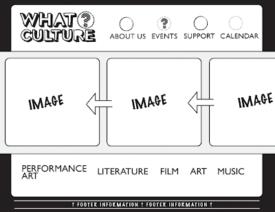
Layout Design for the Category Links:


Layout Design for specific link from Film Page. The user will be able to click on images that are in the scrolling strip, and this is the page that clicking on that image will bring you to. It includes a WHAT?CULTURE rating.

(Almost) Final Designs.

WHAT?CULTURE HOMEPAGE:


Here is the ABOUT US page layout, text still needs to be added to it.

Sunday, May 3, 2009

personal project


For the assignment that is due on Wednesday, I'm making a deck of cards with a box to hold them in. I hope this is considered 3D. The idea came to me when I saw a king card, because on face cards there is a slip image similar to my images for my identity categories. Plus I think it would be really fun to have a deck of cards with my designs on it. I'm working on a design to have on the back of each card.

Saturday, May 2, 2009

Home-Page on website


The homepage has images of the categories that are listed at the bottom, because they are what really makes WHAT?CULTURE. Also in the scrolling strip there is information on the latest issue that is out. Then the other image reveals some flavor about WHAT?CULTURE and what sort of organization they are. I recreated this design, but it is the same image and quote used in the booklet. The arrangement of the images will be switched around, but this "screen-grab" shows the different things that will be displayed on the homepage.

Other changes include the arrangement of information at the top, by the logo. I tried having the navigation aligned vertically, but it still left a lot of white space that I was uncomfortable with. I think having an area that shows who WHAT?CULTURE is affiliated with is a good indication of its identity. So this advertisement area will have so-called "ads" for places, for example, the Walker, MIA, spyhouse coffee shop, thrifty hipster, nomad, and other such places of the like.

From here, I plan on creating a layout for the "About Us" page and another example of what a different categories page will look like - most likely the Music page, because that would be fun. If there are suggestions or strong feelings on having any other pages to give the website a successful overall feel, please share your ideas.

Thursday, April 30, 2009

Updated Website Layout


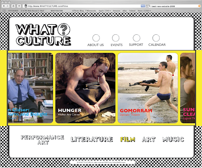
This is an example of what the category pages will look like, and more specifically, this is the film page. The category selected (film) in the bottom part of the navigation menu will turn to to it's specified color, based off of the images I have for each category. The film image has a yellow background, so that is why "FILM" is in yellow. Also, the strip that the images scroll along on will change color according to the category selected. Film = yellow. I'm thinking of having the circled question mark in the logo change colors according to the page being viewed, but I'm not sure if it is necessary or if it would be a nice subtly.
I'm also having troubles with the space to the right of the logo at the top of the page. I want to have those sections. but i'm not sure how much white space is too much at the top. I've thought about having the "about us, events, etc" categories aligned vertically in that space, because I don't like the circles there. I'm open to ideas though...

I've added a web navigation bar to the image to make it seem more web-realistic. The search bar reads: "best new website 2009" (obviously)

Tuesday, April 28, 2009

System Application: Website


This is a rough drafts of my idea for the website. I want the website to be graphically strong, this is why there is the strip in the middle running to the edges of the website that will contain images. The images will slowly move from right to left as you view the website. The images will change depending on the page that is being viewed. For example, if you were on the events page and selected the film category, then the images in the strip would all change to film images that relate to the events going on for that month. It would be a nice way to highlight some of the major events for each category.

Navigation categories on the website include: About Us / Events / Support / Calendar
I plan on creating the layouts for About Us, one event for the Events page, and a Calendar page.

Friday, April 24, 2009

Web introduction page.

Here is a beginning idea I have for the intro page of the website that I'll be creating for my system application. The images used in the book are masked into the pattern of the question mark that I'm using in the logo. I'm thinking of having the question mark be all black, then when you roll over each section of the question mark, then you would see the image of what category you're trying to choose. Then once you click on the category, a new page will open up and you will see the full image for that particular category.


Wednesday, April 22, 2009

I see you checkin' out my standards manual.

So finding a good standards manual is hard. This isn't exactly a standards manual per se, but this is the idea that I would really like to use with my standards manual. The idea that someone is looking at a finished product, but then that picture of the person looking at the finished product is an entirely different product of its own. This seems really fitting for what a standards manual actually is, something that illustrates the make up of a finished product, but in itself is another product of its own. I think I can tie in the WHAT?CULTURE design into this sort of layout for displaying the information in the standards manual, so that they can be displayed nicely together.

Thursday, April 16, 2009

Booklet images


Here is the style that my images will be in the booklet. This image is for performing arts/theater/dance. With such a broad category, like performing arts, I wanted to portray two different sides. So that is why there is a ballet dancer and a breakdancer. The blog has inverted the original colors (for some reason?!). So the background color is meant to be a light cyan and the the cyan shadows are actually that light orange color. This image will also be used in a larger design for the cover, so that there is consistency with the image and my identity. I'm going to try and solve my posting problems, and hopefully have more images up soon.

Saturday, April 11, 2009

Monday, March 23, 2009

inspiration for whatculture.


Collage style would be a great way to show all sorts of culture.


Gorilla coffee is great. I love the simple yet detailed urban look of this. I really like the silhouette structure of the city with the fine detail of the gorilla logo.


I really like the scrapbook aesthetic of this. I could see this style used for my business card.

Sunday, March 1, 2009

Tyranny of the Tagline.

Michael Bierut
The Tyranny of the Tagline

Here are some thoughts from a few magazines on my nightstand right now: This is who we are. This is how we earn it. Solutions for the adaptive enterprise. The right way to invest. We move the world. Life inspiring ideas. Inspiration comes standard. Break through. Make life rewarding. Live famously. Like a rock. Creating essentials. The passionate pursuit of perfection. Born to perform. Beyond petroleum. Pleasure to burn. Your natural source of youth. Get the feeling. Get the good stuff. Win.

Maybe some of these will sound familiar to you. Corporate America certainly hopes so. Millions of dollars are spent contriving these platitudes, exhortations, and non sequiturs, and billions more are spent communicating them to us. Why do ad agencies and their clients love taglines so much?

Taglines used to be called slogans, and in the days of hard sell advertising mavens like Claude Hopkins and Rosser Reeves, they summed up the product and the promise in one viciously efficient little package: Winston tastes good like a cigarette should. Somewhere along the way, though, slogans turned into taglines, vague bits of poetry that sought to transcend the mundane commercial world and commune with the divine. Hence: Get the feeling. (That one's for Toyota.)

Ad agencies put a great stock in taglines, hoping that with a simple phrase they can create the indestructible core of an evergreen advertising campaign. There is a holy grail, of course -- Just do it - the three words that have anchored Nike's presence in the marketplace for what now seems like eternity. It's a hard act to follow, though. Nike's agency, Wieden and Kennedy, won the Microsoft account in the mid-nineties with a tagline they hoped would surpass Nike's: Where do you want to go today? It came and it went.

Of course, taglines have always had their doubters. "Agencies waste countless hours concocting slogans of incredible fatuity," wrote David Ogilvy. "Notice that all of these bromides are interchangeable - any company could use any of them."

And working with taglines is challenging for a graphic designer. When they're freshly minted, clients tend to invest them with the power of a magician's spell, and insist that they appear everywhere. "Locking up" the logo and tagline is tricky, though, and not just visually: logotypes are meant to have long shelf lives, and taglines...well? There are plenty of warehouses full of three years' worth of business cards bearing taglines for campaigns that were abandoned after three months.

This is a bit of a prelude to a remarkable new corporate identity that was unveiled last month for the YWCA. It is not remarkable because of the way the identity relates to the tagline. It is remarkable because, as far as I can tell, the tagline is itself the identity.

Throughout its 150-year history, the YWCA has been dedicated to two things: eliminating racism and empowering women. I have to admit I did not know this; I just found out on their website. I thought the YWCA was simply the female version of the YMCA. Obviously, I'm not alone in my ignorance, so the YWCA must have decided that their old identity, a stylized Y by Saul Bass, just wasn't getting the job done.

Having designed many identities for non-profit groups, I can imagine what a challenge this must have represented. What kind of typeface communicates the elimination of racism? What kind of pictorial image or abstract shape projects the empowerment of women? One common argument, of course, is the Paul Rand one, the claim that the logo has no inherent significance, and that it gains meaning only through association with the activities of the group it stands for: think of the peace sign or the swastika. But this requires a long-term investment, and for the YWCA, desperate times must have called for desperate measures.

So Landor, the creators of the new YWCA identity, did something so obvious it's amazing it hasn't been done before. They simply set the words "eliminating racism" and "empowering women" and put them on two lines in a bold sans serif typeface. Then underneath, and smaller, is the actual organization's name: YWCA. Voila. You can love it or hate it, but the one thing you can't deny is that it certainly communicates the organization's raison d'etre, at least to people who can read.

Corporate identity is a trendy business. In the last twenty years we've gone from logos with horizontal stripes (a la IBM) to swooshes (Nike) to geometric shapes (Target). Brace yourself: the tyranny of the tagline may be just beginning.

Monday, February 16, 2009

WHATCulture?

Here are the developing ideas for what is to become whatculture.


Wednesday, February 11, 2009