Sunday, May 10, 2009

(Almost) Final Designs: Part II

Layout Design for the Category Links:


Layout Design for specific link from Film Page. The user will be able to click on images that are in the scrolling strip, and this is the page that clicking on that image will bring you to. It includes a WHAT?CULTURE rating.

(Almost) Final Designs.

WHAT?CULTURE HOMEPAGE:


Here is the ABOUT US page layout, text still needs to be added to it.

Sunday, May 3, 2009

personal project


For the assignment that is due on Wednesday, I'm making a deck of cards with a box to hold them in. I hope this is considered 3D. The idea came to me when I saw a king card, because on face cards there is a slip image similar to my images for my identity categories. Plus I think it would be really fun to have a deck of cards with my designs on it. I'm working on a design to have on the back of each card.

Saturday, May 2, 2009

Home-Page on website


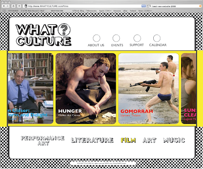
The homepage has images of the categories that are listed at the bottom, because they are what really makes WHAT?CULTURE. Also in the scrolling strip there is information on the latest issue that is out. Then the other image reveals some flavor about WHAT?CULTURE and what sort of organization they are. I recreated this design, but it is the same image and quote used in the booklet. The arrangement of the images will be switched around, but this "screen-grab" shows the different things that will be displayed on the homepage.

Other changes include the arrangement of information at the top, by the logo. I tried having the navigation aligned vertically, but it still left a lot of white space that I was uncomfortable with. I think having an area that shows who WHAT?CULTURE is affiliated with is a good indication of its identity. So this advertisement area will have so-called "ads" for places, for example, the Walker, MIA, spyhouse coffee shop, thrifty hipster, nomad, and other such places of the like.

From here, I plan on creating a layout for the "About Us" page and another example of what a different categories page will look like - most likely the Music page, because that would be fun. If there are suggestions or strong feelings on having any other pages to give the website a successful overall feel, please share your ideas.

Thursday, April 30, 2009

Updated Website Layout


This is an example of what the category pages will look like, and more specifically, this is the film page. The category selected (film) in the bottom part of the navigation menu will turn to to it's specified color, based off of the images I have for each category. The film image has a yellow background, so that is why "FILM" is in yellow. Also, the strip that the images scroll along on will change color according to the category selected. Film = yellow. I'm thinking of having the circled question mark in the logo change colors according to the page being viewed, but I'm not sure if it is necessary or if it would be a nice subtly.
I'm also having troubles with the space to the right of the logo at the top of the page. I want to have those sections. but i'm not sure how much white space is too much at the top. I've thought about having the "about us, events, etc" categories aligned vertically in that space, because I don't like the circles there. I'm open to ideas though...

I've added a web navigation bar to the image to make it seem more web-realistic. The search bar reads: "best new website 2009" (obviously)

Tuesday, April 28, 2009

System Application: Website


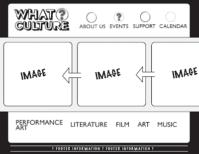
This is a rough drafts of my idea for the website. I want the website to be graphically strong, this is why there is the strip in the middle running to the edges of the website that will contain images. The images will slowly move from right to left as you view the website. The images will change depending on the page that is being viewed. For example, if you were on the events page and selected the film category, then the images in the strip would all change to film images that relate to the events going on for that month. It would be a nice way to highlight some of the major events for each category.

Navigation categories on the website include: About Us / Events / Support / Calendar
I plan on creating the layouts for About Us, one event for the Events page, and a Calendar page.

Friday, April 24, 2009

Web introduction page.

Here is a beginning idea I have for the intro page of the website that I'll be creating for my system application. The images used in the book are masked into the pattern of the question mark that I'm using in the logo. I'm thinking of having the question mark be all black, then when you roll over each section of the question mark, then you would see the image of what category you're trying to choose. Then once you click on the category, a new page will open up and you will see the full image for that particular category.