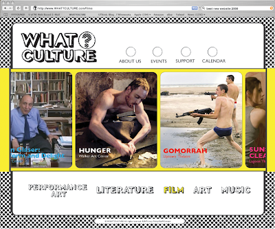
This is an example of what the category pages will look like, and more specifically, this is the film page. The category selected (film) in the bottom part of the navigation menu will turn to to it's specified color, based off of the images I have for each category. The film image has a yellow background, so that is why "FILM" is in yellow. Also, the strip that the images scroll along on will change color according to the category selected. Film = yellow. I'm thinking of having the circled question mark in the logo change colors according to the page being viewed, but I'm not sure if it is necessary or if it would be a nice subtly.
I'm also having troubles with the space to the right of the logo at the top of the page. I want to have those sections. but i'm not sure how much white space is too much at the top. I've thought about having the "about us, events, etc" categories aligned vertically in that space, because I don't like the circles there. I'm open to ideas though...
I've added a web navigation bar to the image to make it seem more web-realistic. The search bar reads: "best new website 2009" (obviously)
A few things:
ReplyDelete1. Performance art should be on one line. Reduce it to read just "performance"- art is repetitive.
2. White space in top right is unnecessary. Try vertical nav, aligned to the right (matching up with the 'c' in music at the bottom)
3. Where are the images and quotes from your magazine? They are strong components of your identity, and should exist somewhere, in some form, on your website for consistency.
4. Changing the color is good– changing the color of the ? in the logo would be a nice subtlety.
Keep goin!